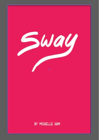
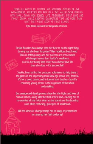
 I know it's so five years ago, but this is the colour I chose for the cover. It's bright and upbeat and hey, my youngest daughter was born that year, so it's magic!
 Ooh, colour plus title - things are getting crazy exciting around here! My name's even on there, making me enjoy the delusion of fame.
 I initially suggested the silhouettes of the three main characters should feature on the cover. Then I wondered if it was a bit too 'ménage à trois' (no judgment if you're into that but my book isn't about that. Maybe the next one will be. Maybe not.)
I decided to focus on main character Saskia, and we found nice silhouettes of her on the net (which we paid for. No artists are being exploited in the making of this particular young adult novel.)
I decided I preferred the Saskia on the left, so...


No comments:
Post a Comment